Making Buttons for Your Favorite Fandom
 5 Tips For Great Campaign Buttons
 How to make campaign buttons:10 Essentials for 2024
 How Colors Can Change the Mood of Your Custom Buttons
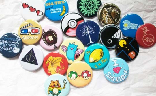
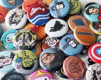
"Why make a fandom button with someone else's logo on it?" You might ask, "Aren't I competing with the official merchandise?" Not if you get creative. In fact, a lot of obscure titles could use some fan-made love. Was your favorite TV show canceled before anyone bought licensing rights? Help keep its memory alive. Can you think of a band that's never brought the merch table to your town? Give them a little free promotion.
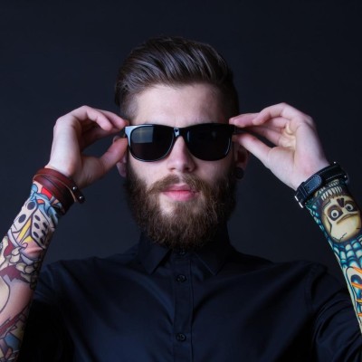
A custom made button helps express your creativity. With full control over the design, you can put any character's face on it, play with the motifs, and make a batch in your favorite color. As an aside, fan works are great for providing alternatives to what's out there. If all the official gear features the hero, maybe you can help recruit minions for the villain.
Even better, Custom Button Co. offers a wide variety of types and formats. So between round, square, and rectangular buttons, keychain buttons, and zipper buttons, you can make plenty of schwag. If you're an artist, that opens up even more possibilities.
Fanart buttons are great advertising. If you have a Deviantart gallery or Etsy store you want to promote, what better way than to pin miniature billboards to your friends' chests? A three-inch button with an art sample packs much more visual punch than a boring old business card, too, and unlike flyers, your fellow fans will be delighted to get them.
Making Custom Fandom Buttons
For more information on making custom fandom buttons, see our how-to. But here's the short version to get you started:
What You Need
- Art at 300 dpi or higher: Color mode set to CMYK, not RGB.
Art Tips
- It's strongly suggested you format the art to the largest size possible. That way, you can shrink it to any other size.
- Simple, iconic logos like most superhero insignias can often be downloaded from sites like Vectortemplates or Vectorsland. Or, even better, you can draw and vectorize your own renditions of them with Illustrator or Inkscape.
- For more complicated images, high-quality photos or art can often be found in press kits and on official websites. Always get the biggest images you can find. It's better to have a higher-than-necessary resolution than the opposite.
Distributing Fandom Buttons
Comics, sci-fi, and anime conventions have long been known as the best places to score some sweet pins. So if you have an artists' alley or dealers' room table, why not set them out in a basket for people to browse through? You can also distribute your buttons at fan club meetings and even use them as badges. If you're holding a themed event, use pins in place of wristbands. There's no glue to accidentally rip out arm hair, they're much easier to remove, and best of all, your visitors will leave with a memento that can last for decades.
Legal Questions
"Can I sell my fandom buttons?" you might ask.
Well, here comes the buzzkill: under copyright law, anything bearing a logo or image or character from another series counts as a derivative work. That means that you can't legally sell them without permission from the copyright holder. Certain companies are more lenient than others, though. In the cases of indie creators, some of them might even appreciate that a fan went out of his/her way to promote their products in meatspace, so contact them about it. If you're still unsure, always ask well in advance of selling anything.
To stay in the clear, it's usually better for your fan works to stay a hobby. But, since most fandoms are motivated by passion instead of profits, that shouldn't be a problem.
Any shows, bands, or causes you'd like to make buttons for? Head over to Custom Button Co. for all your fandom button needs.