Making Buttons for Your Favorite Fandom
 5 Tips For Great Campaign Buttons
 How to make campaign buttons:10 Essentials for 2024
 How Colors Can Change the Mood of Your Custom Buttons
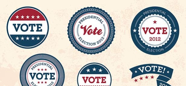
Before the era of YouTube videos, Reddit threads, and live video press conferences, there was one campaign staple that was arguably the cornerstone of promoting a political candidate, and that was the campaign button. Since the 1896 McKinley campaign, buttons have been used as an easy, effective and affordable way to support a candidate, and they continue to do so today. Whether you're running a presidential campaign or just hoping to get elected to student government, it can certainly pay to promote your campaign with a button; however, it's important to ensure that your design is effective and well-planned. If you're planning to design a button, read on. We give you 10 tips to ensure that you make a button that is clear and aesthetically pleasing.
1. Short but Memorable Slogan or Text
You probably already have this for your campaign if you're running one, but be sure to include your slogan — or simply your name — on your button design. People who see the button will need to know who or what the button is for. Be sure to keep the slogan short, or use a shortened version on the button, so that people can see all the words clearly.
2. Visible Text Size
In the interest of clarity, make sure that the text size you use for the words on your button is large enough to be seen. It might be tempting to make the text small so that you can fit more words in, but words are pointless if they're not big enough to be seen from a distance.
3. Readable Font
Also, be sure that any text you put on the button is in a legible font. Choose a simple serif or sans serif font, not one that resembles script or handwriting. Fancy fonts can be fun, but they defeat the purpose if they're not readable.
4. Bright, Bold Colors
A campaign button should be eye-catching, and for this reason, it's important to design it in bright colors that pop. Make sure that the text and background are two very different colors so that it's easy to read the words from a distance. Consider using contrasting colors for background and text.
5. Large Enough Button Size
Make sure the button itself is large enough to be noticed. You don't want people to miss it. However, don't go overboard. Nobody wants to wear a button that is embarrassingly big or flashy.
6. Shape that Fits Your Campaign
The traditional campaign button might be a circle, but your button can come in any shape that suits your campaign. Consider making a star button for a little patriotism, or a heart button if running for homecoming court. Unique buttons can draw eyes and make people pay attention to the message of your campaign.
7. Include Your Website Address
If you have a website for your campaign or yourself as a candidate, make sure you include the address on the button. Keep it short and sweet; this way, people will know how to find out more about you after they see your button.
8. Verify Image Quality
If you're going to use a picture of yourself (or any photographic image) on your button, ensure that it's of good enough quality to be seen. Consider enlisting a design expert to make sure that the downsized image doesn't become too pixelated to be seen clearly.
9. Don't Go Overboard
Designing a button can be fun and a great way to get your personality or campaign's message across. However, be sure not to go overboard when it comes to designing the button. Clarity is key when it comes to campaigning, so leave the excess graphics or wingdings behind.
10. Check Out Previous Campaign Buttons
A great way to start designing your campaign button is by looking at other successful campaign buttons from the past. This is a great way to get inspiration for your design and see what worked and what didn't.
Download Free Campaign Button Vectors Here!
Customization Techniques
When it comes to creating campaign buttons, personalization does wonders.
How so? Customization helps your custom campaign button stand out and resonate more deeply with your audience.
Here are some effective techniques:
Unique Graphics and Icons
Consider using distinctive graphics or symbols that encapsulate your campaign's core values or the candidate's personality. This could range from a specific logo to an emblem that is immediately associated with your campaign. Unique imagery is a crucial aspect of how to make political buttons stand out.
Interactive Elements
Adding elements like QR codes or URLs that lead to your campaign website can engage people further. This not only makes your button more interactive but also drives traffic to your online platforms.
Custom Shapes and Sizes
While traditional buttons are round, exploring different shapes can make your campaign buttons more noticeable. Shapes like stars, badges, or even custom silhouettes related to your campaign theme can make a bold statement.
Textural Elements
Using varied textures can add a tactile dimension to your buttons. Consider embossed text or raised patterns, which can make your button more memorable.
Limited Edition Series
Releasing limited edition buttons for special events or milestones can create a sense of exclusivity and collectability.
Distributing Your Campaign Buttons
Effectively distributing your campaign buttons is crucial for maximizing their impact. Here are some strategies to consider:
1. Strategic Placement
Distribute buttons at campaign events, rallies, and other gatherings where your target audience is present. Consider collaborating with local businesses or community centers to have your buttons displayed or handed out.
2. Use Volunteers
Mobilize your campaign volunteers to distribute buttons in high-traffic areas such as markets, festivals, or college campuses. This not only spreads your message but also allows for personal interaction, which can be more persuasive.
3. Online Campaigns
Use your digital platforms to promote your buttons. You could run contests, giveaways, or simply offer them as a token of appreciation for donations made online.
4. Direct Mailing
For a more targeted approach, consider sending campaign buttons directly to your supporters or potential voters. This can be a pleasant surprise for the recipients and encourage them to show their support publicly.
5. Collaborations
Partner with local organizations, clubs, or influencers who align with your campaign's ideals. They can help distribute your buttons to a wider audience and lend credibility to your campaign.
FAQs
What are the best materials for making campaign buttons?
To make campaign button, the ideal materials will depend on your budget and environmental considerations. Traditional metal-backed buttons offer durability and a classic look. They're ideal for a timeless, professional appearance and are resistant to wear and tear.
Alternatively, for a more eco-friendly and cost-effective option, consider using recycled plastics or biodegradable materials. These choices not only reduce environmental impact but also resonate with voters who value sustainability.
How can I create a design that stands out?
A standout design is a cornerstone in how to make campaign buttons that capture attention. Focus on bold, contrasting colors and legible fonts. A clear and concise message is key. Think about innovative campaign button ideas like incorporating interactive elements such as QR codes or unique symbols that represent your campaign's ethos.
Remember, a button is not just a promotional tool; it's a reflection of your campaign's identity. So, ensure that the design aligns with your campaign's overall branding and messaging strategy.
What are some cost-effective methods for button production?
Digital printing is a versatile and economical solution on how to make campaign buttons on a budget, especially for large quantities.
Another cost-effective strategy is to partner with local suppliers or print shops, which can often provide competitive pricing and reduce shipping costs.
Additionally, consider organizing community-driven button-making workshops, which can be a fun and engaging way to involve supporters while cutting down on production costs.
How can I distribute my campaign buttons effectively?
Distribution strategy plays a crucial role in how to make campaign buttons have the maximum impact. Engage your community at local events, parades, and town halls where you can hand out buttons personally.
Utilize your campaign's social media platforms to promote and create campaign button giveaways, encouraging followers to share photos of themselves wearing the button. This not only distributes your buttons but also amplifies your campaign's reach digitally.
Moreover, incorporating buttons into direct mail campaigns can add a personal touch that resonates with recipients.
Are there eco-friendly options for campaign button materials?
Yes, eco-friendly options are increasingly available and popular. Look for suppliers who specialize in sustainable production methods, such as using recycled metal or biodegradable components.
Some manufacturers offer buttons made from sustainable wood or bamboo, which are not only environmentally friendly but also add a unique aesthetic to the buttons. Opting for eco-friendly materials is a great way to demonstrate your campaign's commitment to environmental stewardship.
How do I ensure my button designs are legally compliant?
Legal compliance in design campaign buttons is paramount. This includes ensuring that all imagery and text used are either original or appropriately licensed. Be mindful of copyright laws, especially when using photographs or artwork.
It's also important to adhere to political advertising regulations, which may vary by region. Include necessary disclaimers or authorization statements as required by law.
Also, consulting with a legal advisor who specializes in political campaign law can provide guidance and help you avoid potential legal pitfalls.